Newport Beach interior designers share their tips for incorporating current trends in a way that authentically fits your home.
By Ashley Breeding
Just as the global “Big Four” fashion weeks declare what will be popular in fashion each season, they also predict what will trend in art, architecture and home design. Pink, in its many shades, was equally prominent on the runway in 2023 as it was in wallpaper, interior paint, upholstery and beyond. Pantone even proclaimed Viva Magenta its Color of the Year.
Currently forecasted for homes: eco-friendly materials, minimalism, bright colors and a return to art deco. While interior design trendsetters are often inspired by what’s happening in the fashion industry, experts in the field know these styles aren’t what’s paramount when making such a heavy investment.
First and foremost, the aesthetic of a home should reflect the tastes of the people living in it, according to veteran designers Shannon McLaren, owner of Prairie Interiors, and Casey Hill, founder of her eponymous studio, in Newport Beach. No matter your style, your space should help tell your story—think “objets d’art” collected while traveling, antique furnishings passed down through a family for generations (even reimagined with paint or new upholstery), and color palettes or pieces that hint at your affinity for a certain foreign culture.
At Prairie, McLaren’s team gathers ideas from a variety of sources. “We touch upon all our influences while taking inspiration from our own clients and try to match their personality through our lens,” explains the former celebrity stylist. “We find that balance.”
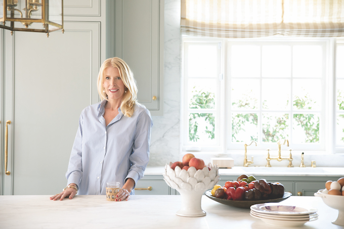
Hill says she adheres to her clients’ tastes while also prioritizing the architectural integrity, time period and location of a home, as well as helping them capitalize on elements like natural light and outdoor space. She too understands that style preferences are not always so linear. Say you reside in a Spanish colonial, but crave an air of midcentury modern; Hill—who also holds a master’s degree in architecture and trained under the late LA-famous decorator Suzanne Rheinstein—knows how to merge the two in a way that makes sense.
This season, maybe you want to try minimalism, but not in a way that feels stark or cold. For example, Hill is a self-described minimalist, but in a way that differs from modern design (defined by simplicity, function and emptiness). Rather, her focus is on decluttering. “I encourage clients to be minimalistic in what they put out [in the open],” she explains. “So much time and energy goes into designing your beautiful spaces—each one should be clean and tidy.”
And maybe you dig reemerging art deco style (short for “arts décoratifs”), but not to the extent of gilded wallpaper and checked floor tiles. Perhaps intense color is cheerful in moderation, but only in moderation.
Here, Hill and McLaren share their tricks for incorporating the season’s trends in a way that feels authentically yours.
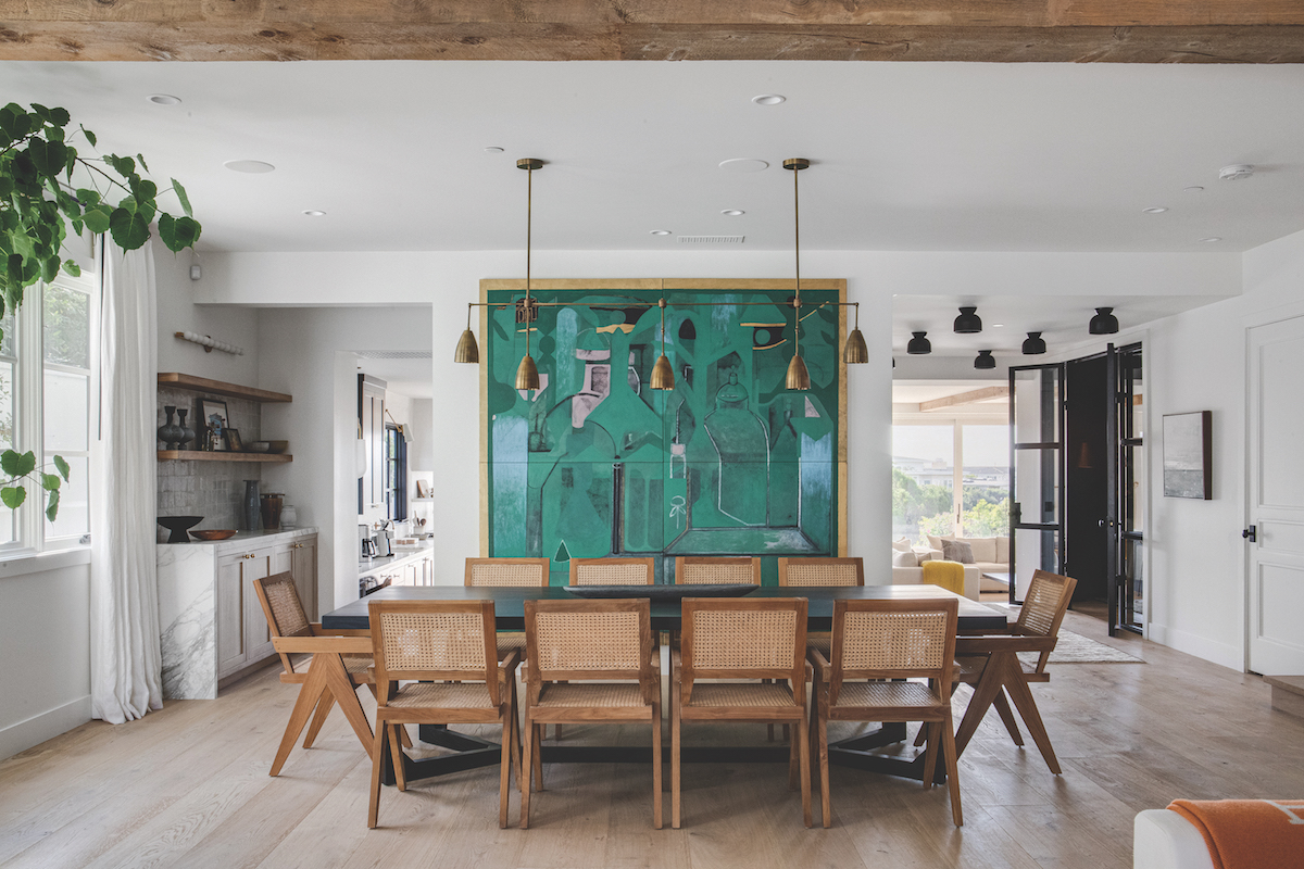
Color Inside the Lines
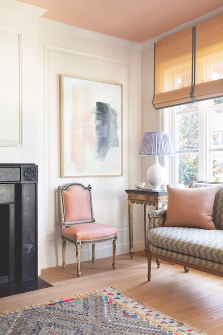
Hill’s portfolio of elegant yet whimsical rooms all embrace color—and lots of it. “I never use a traditional white paint,” she insists. “There are just so many colors that really enhance a space. … I use color in every project.”
While brilliance dominates design showrooms this season, Hill prefers layering softer shades that have also made a comeback (pink flush is a favorite that “makes everyone in the room glow when the light hits it,” she points out) with a sea of blues or sunny yellows that “are rich but not too saturated.”
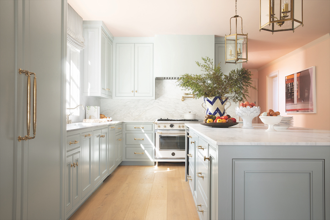
From millwork and wall paint to Tibetan rugs and textured fabrics, blue is a color Hill integrates frequently, mostly at the behest of clients who seem to have taken a liking to it since the pandemic, she says.
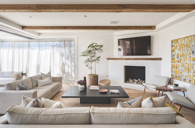
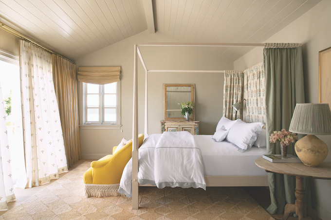
While there’s no limit to the number of different colors that Hill will include in one room, the nature of a space determines hue. “For example, a study or living area can [handle] more vibrance, while a bedroom should be more subdued,” she says. Think muted blue-grays complemented by soft greens and cream to foster tranquility and rest.
Many Prairie clients favor McLaren’s earthy bent. “Our palette is mostly neutral, and then we’ll pick one or two bright colors to pop in,” she says. “You have to be careful with color. … It’s a dance to find balance. … Too much, and it can look childish very quickly.”
Her solution (so long as the client agrees, of course) is to pick one item in a room to be the focal point of color—such as an emerald-print stair runner, a patterned sofa or even a piece of hot-pink pop art—and pare it down with neutrals. She defines neutral as “any color that is found in nature and has a little bit of brown in it—olive green, mustard yellow.”
Color cohesiveness is also something to consider, McLaren adds. “Rooms don’t have to be twins, but they do have to be friends.” She suggests choosing a group of colors to be repeated throughout the home. “Maybe one room is wild and the next is a little quieter, … but every room should connect in vibe and palette. … All rooms in a house should feel like they were [decorated] at the same time.”
Art Deco Details
Rising in popularity in the 1920s and 1930s, hallmarks of art deco style include bold geometric prints, rich color and lots of visual drama. (Think “The Great Gatsby” or “Midnight in Paris.”)
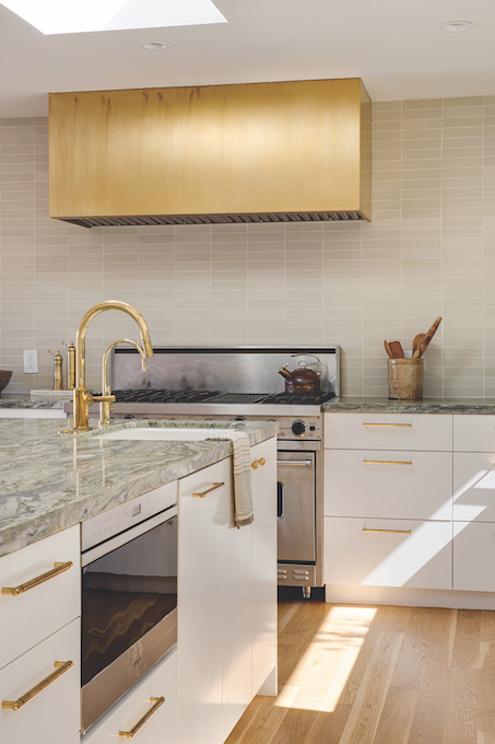
Some home design forecasters say this style is returning. McLaren suggests small details to hint at the time period rather than an all-over transformation. “I appreciate this style, but it can get kitsch real fast,” says McLaren, who finds subtler ways to satisfy a craving for decadent flair, like brass hardware (faucets and light fixtures) or a cascading glass chandelier to catch the eye.
“A lot of people like art deco wallpaper, but it’s a little too aggressive for me personally,” she adds. If you’re feeling playful with your space, she advises, “a powder room is a great place to experiment.” Second best: a formal dining room that’s a high-traffic area, but not a room you use often enough to grow tired of it.
When it comes to Hill’s approach, she loves to create a “wow” factor with a mix of softer geometric patterns (think small floral vines and Indian block prints versus converging lines or concentric circles that are common with art deco). “There’s so much research and thought behind these designs,” she says of ancient textiles that have been reimagined. Curtains, custom lamp shades, and walls in powder rooms and dressing rooms are a few examples of areas to play with patterns.
“The key to mixing prints is to look at the scale,” Hill says. “If I have a big print, I won’t [pair] it with a second big print but will instead use a small floral or an interesting stripe or something that has geometry to it to offset that big floral. … The ‘hero print’ of the room is the big floral, while the others are supporting roles.”
Made by Nature
From curtailing environmental impacts to reducing health hazards, there are many reasons to use natural materials—such as wood, stone, cork and natural fibers, which are growing in popularity—when designing and decorating a home. Aesthetics are an added benefit.
“The wear and tear of natural marble, for example, is really beautiful because it shows patina,” notes Hill, who hones the stone for a velvety touch on kitchen countertops. “It shows that you’ve enjoyed the space—cooked in it, had dinner parties, spilled the red wine. It should be celebrated.”
Soapstone is another of Hill’s favorites for kitchen countertops, while limestone works well for everything from fireplace mantels to floors in bathrooms and laundry rooms. Cooler materials are offset by warmer ones, like reclaimed oak—a rule of balance she carries into her furnishings by mixing wood pieces with steel or concrete.
McLaren notes that natural elements add a certain quality that typically can’t be found with synthetic materials.
“I like imperfection in design, which you get with natural materials over manufactured ones,” she says. “I love a piece of wood with [color] variants in the grain, because it adds depth and warmth to a space.”


