The wallpaper trend is back—and it’s fresher than your grandma’s florals.
By Ashley Breeding
Minimalism has had its moment—more than once. Now, homeowners are embracing more visual interest for their living spaces. One way that interior designers are helping them achieve this look is through the use of wallpaper. But it’s not your grandmother’s floral anymore, points out Laura Brophy, founder of an eponymous interior design firm in Newport Beach and Costa Mesa—“Unless you want it to be. …[Rather], we’re reimagining it in a way that feels fresh and part of a larger story.”
Shannon McLaren, proprietor of Prairie Interiors, also in Newport Beach, says her clients desire depth. “They are yearning for something more tactile, expressive, and layered—and wallpaper offers just that,” she says. “It has the power to immediately warm a space and reflect personal taste.”
Both designers note a trend toward prints that are more artful and tailored. Think hand-drawn botanicals, murals, grass-cloth, and elevated stripes. “They have beautiful texture and tonal variation—it’s less about shocking color, and more about enveloping a space with mood,” McLaren says.
Choosing Your Vibe
When considering where—and whether—to install wallpaper, start with the room’s purpose and how you want to feel in it. (Both Brophy and McLaren recommend enlisting an interior designer if you’re not sure how to answer that.)
“Is the room a high-traffic area or a quiet retreat,” Brophy asks. “What feeling do you want the room to evoke—romantic, grounded, dramatic, serene” McLaren adds. Texture, color, hue, and prints all play into the overall energy wallpaper creates within a space. For example, consider bolder design for dining rooms or powder rooms; lean toward textures in subdued colors for bedrooms or spas. Other things to consider are the home’s architectural style, as well as the room’s scale and natural light.
While a wallpaper pattern should nod to the style of the home itself, it doesn’t have to match perfectly, both designers agree. “Design is at its best when it doesn’t feel prescriptive,” McLaren says. “While it can be beautiful to echo a home’s architectural language, we love to create contrast too. A delicate floral in a midcentury home, or a structured stripe in a historic Victorian can feel unexpectedly fresh. It’s all about balance and using the bones of the space while expressing something personal.”
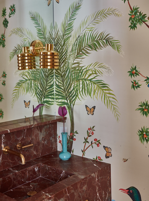
In a smaller space, large-scale patterns or vivid colors can feel overwhelming, McLaren says. “In smaller rooms, tighter repeats or textures work better,” McLaren says. For one “pocket-sized” powder room in a midcentury Newport Beach residence (“The House With the Tree,” recently featured on the Newport Harbor Home Tour), the designer complimented a red-marble fabricated sink with a whimsical life-size Pierre Frey mural wallpaper. “We only [treated] the three walls [opposite] the sink…it needed flair, but this was just the right amount to make the space really unexpected and beautiful,” she says.
For a small rooms, such as a bath or study, Brophy suggests wallpapering only an accent wall to add interest if you’re worried about overdoing it. Wallpaper in bathrooms is gaining popularity, partly because it saves money on materials like stone or tile, and some clients also feel it’s a safe place to have fun and be playful. “But it doesn’t have to be bold,” she says, noting that she personally appreciates a bold bathroom. “Even a subtle gold thread, herringbone, or stripe through a tonal wallpaper adds texture and makes a statement.”
McLaren also prefers the bold approach. “In a small space, we usually say go all in,” she says. “Wrapping the entire room in wallpaper makes it feel intentional and jewel-boxed. An accent wall can work, but [to me] it often feels like a compromise. If you’re committing to wallpaper, let it embrace the space fully.
“Bathrooms are the perfect place to surprise and delight,” she continues. “Wallpaper transforms a utilitarian room into something memorable.”
She’s also seeing more wallpaper in mudrooms, laundry rooms, and even closets— “overlooked spaces that benefit so much from a little intention,” she says.
Muted, neutral, and soft-toned textures and prints aren’t just for small spaces—they can also enhance light, provide versatility, and create a calming atmosphere in a large room. In another oceanfront house in Newport, McLaren added depth to an upstairs family/TV room by installing a textured tan-and-white, batik-print wallpaper (also Pierre Frey, a high-end brand favored by the designer herself and many clients). “We used a [Frey] fabric on the sofa to mix patterns together and create warmth,” she says.
When choosing colors, consider how much natural sunlight a room lets in. “Darker prints can feel moody or oppressive in dim rooms,” McLaren says, while brighter ones have the opposite effect. To create the illusion of a larger space, opt for light shades (think whites, neutrals, soft blues and greens) that will reflect sunlight.
When wallpapering a space with a view of an adjoining space (a foyer or hallway, for instance), colors don’t have to match, both designers agree, but “there should always be a sense of flow,” McClaren says. “We often like to carry over a tone, a value, or a finish from one room to the next. If the wallpaper in one space has sage green, maybe the adjoining room has that same hue in upholstery or drapery.”
On Trend
In addition to bathrooms and quiet nooks, another unexpected place that the wallpaper trend is rising is overhead. “Wallpapering a ceiling is a bold and often magical move—it draws the eye up, adds dimension, and gives a sense of being enveloped by design,” McLaren says. “It’s especially effective in powder rooms, nurseries, and bedrooms.” She’s also used it in formal dining rooms. “If the ceiling has architectural detail like coffers or beams, the result can be breathtaking.”
For a kid’s room, she loves a navy paper will gold stars. “Or anything that mimics the sky…it’s my take on the Italian Renaissance.”
Brophy’s clients are also exploring the height of this trend, which she calls “the fifth wall.” Recently, in a child’s room, she installed plaid fabric on the ceiling—a twist that brought more texture into the space—mimicking the seafoam-green shade of the walls.
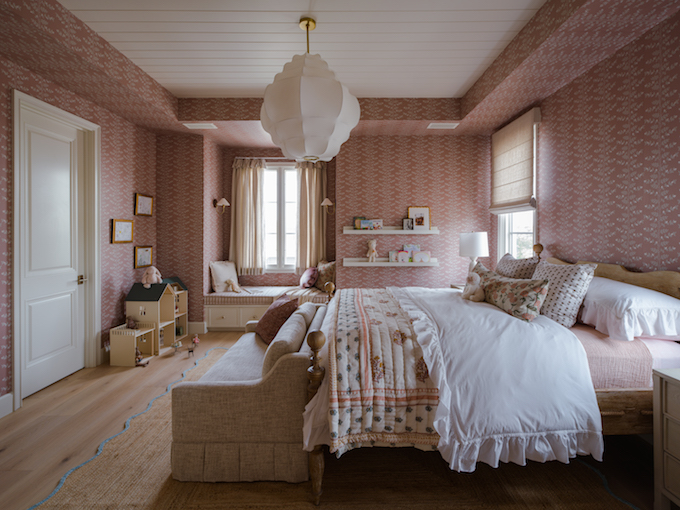
Those shopping samples might have noticed a peel-and-stick trend and wondered, “Is this a quality product.” Brophy says yes—but it’s tricky to install, so best to enlist a pro. She nods to an ombré peel-and-stick paper she chose for a young girl’s room she designed six years ago, offering this tip: “When choosing wallpaper for a kid’s room, avoid anything cutesy; instead, choose something they will grow into.”
So, what happens if you commit to something bold—and then decide you can’t live with it? “One thing you can do [upfront] is ask the installer to go easy on the adhesive on the back,” Brophy suggests. That’ll make it easier to take down, which you’ll need to do before painting or replacing it with a new wallpaper.
Overall, both designers see wallpaper as “a tool to tell a story,” McLaren explains. “Create a room that feels storied and soulful, whether through a hand-printed floral, a subtle texture, or a joyful pop of pattern where you least expect it.”


